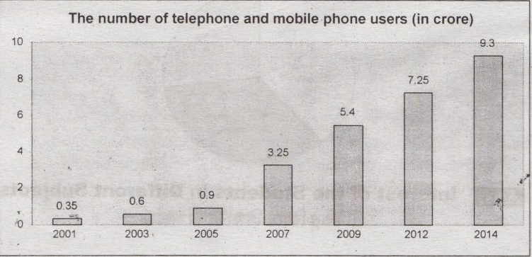
The graph below shows ‘The number of Telephone and Mobile Users‘ from 2001 to 2014. Describe the graph in 150 words. You should highlight and summarize the information given in the graph.
The graph shows the number of telephone and mobile users from
the year 2001 to 2014. At a glance, the graph shows that there has been a
significant increasing trend of phone users over time. It is seen that in 2001,
only 0.35 crore people used telephone and mobile phone. Two years later, that
is, in 2003, the users increase to 0.60 crores. We notice a further increase in
2005 when the users turned to 0.90 crores. The increasing trend continues in
later years. Thus in 2007, the users are 3.25 crore, in 2009 the users are 5.40
crore, in 2012 they are 7.25 crore, in 2014 they are 9.30 crore. The growth
trend over the period is 0.25 crore, 0.30 crore, 2.35 crore, 2.15 crore, 1.85
crores, 2.05 crore. It is found that the highest growth (2.35) occurs between
2005 and 2007 and the lowest growth (0.25) occurs between 2001 and 2003. Thus,
the graph shows a clear idea about the increasing trend of telephone and mobile
users from the year 2001 to 2014.


0 comments:
Post a Comment